| | Fonts and the 'feel' of a game |  |
|
|
| Author | Message |
|---|
fronkhead
Disciple of Scullion
Posts : 1616
Points : 1694
Join date : 2013-01-18
| Subject: Fonts and the 'feel' of a game  Wed 26 Jun 2013 - 14:33 Wed 26 Jun 2013 - 14:33 | |
| This is a topic I've been meaning to share with for a while now. How important do you find the text font developers choose in their games in terms of presentation? I've always found the font to help give a game a certain atmosphere and 'feel' -- moreso for text-heavy games like RPGs. Which is why I've been a bit disappointed with Nintendo recently, instead using their system fonts in games where they would use a specially made one. A good example of this was Mario Kart Wii, which used Wii system font in the place of the 'Mario font' in its menus, and HUD. I thought this made the game feel a bit more sterile, and seeing Game & Wario ditch the 'WarioWare font' was also a bit disheartening. One of my favourites has to be the font in Link's Awakening -- looks fabulous considering how low-res the GB's screen is, and kind of lends the game a dinky adventuring feel to it. 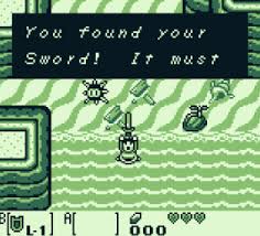 And then there's the interfaces and fonts in Matsuno's RPGs, which simply fit their stat-heavy inventories well. You can just tell Crimson Shroud's from him by looking at the lower screen, with its glorious looking numbers.  And one of my worst was the PAL version of Tales of Phantasia. Struggling to get a screenshot of it, but it replaced the more playful, bold font used in the US version's battles with this horrible thin, tiny all-caps font which didn't look welcoming at all and didn't fit the tone of the game. Please do share your favourite examples of in-game fonts, both good and bad, would be great to have a good collection going on here. |
|
| | |
beemoh
Koopaling
Posts : 2007
Points : 2050
Join date : 2013-01-15
Age : 39
Location : Writing and arithmetic
| | Subject: Re: Fonts and the 'feel' of a game Wed 26 Jun 2013 - 16:11 | |
| *Obligatory Dead Rising comment* |
|
| | |
Balladeer
DIVINE LONELINESS
Posts : 26357
Points : 25192
Join date : 2013-01-16
Age : 34
Location : Admintown
| | Subject: Re: Fonts and the 'feel' of a game Wed 26 Jun 2013 - 17:02 | |
| |
|
| | |
Silver light
Ing Warrior

Posts : 343
Points : 351
Join date : 2013-01-16
| | Subject: Re: Fonts and the 'feel' of a game Wed 26 Jun 2013 - 20:56 | |
| Hmmm, well i don't really pay much attention to the font used i guess xD since i actually can't think of anything- - sporkhead wrote:
- PAL version of Tales of Phantasia
Oh. Oh. You just HAD to remind me. Never again ;_; |
|
| | |
beemoh
Koopaling
Posts : 2007
Points : 2050
Join date : 2013-01-15
Age : 39
Location : Writing and arithmetic
| | Subject: Re: Fonts and the 'feel' of a game Thu 27 Jun 2013 - 14:17 | |
| Super Paper Mario deserves some love in this thread, not necessarily for the font itself, but for how they used it- changing the size, making it all wobbly, whatever, depending on what they wanted to portray. |
|
| | |
Jimbob
Bargain Hunter

Posts : 4611
Points : 4637
Join date : 2013-01-15
Age : 41
Location : Milton Keynes
| | Subject: Re: Fonts and the 'feel' of a game Sat 29 Jun 2013 - 19:07 | |
| - beemoh wrote:
- Super Paper Mario deserves some love in this thread, not necessarily for the font itself, but for how they used it- changing the size, making it all wobbly, whatever, depending on what they wanted to portray.
Agreed. The punk-rock of game fonts  |
|
| | |
fronkhead
Disciple of Scullion
Posts : 1616
Points : 1694
Join date : 2013-01-18
| | Subject: Re: Fonts and the 'feel' of a game Tue 2 Jul 2013 - 0:55 | |
| Good shout on the Paper Mario font, I loved the way the text would go wobbly, really added character to the moment.
Speaking of changing font size, Animal Crossing New Leaf *did* shock me with the massive text that cropped up after catching my first whale shark. |
|
| | |
Balladeer
DIVINE LONELINESS
Posts : 26357
Points : 25192
Join date : 2013-01-16
Age : 34
Location : Admintown
| | Subject: Re: Fonts and the 'feel' of a game Tue 2 Jul 2013 - 9:37 | |
| I prefer the "Blech!" when you catch a giant isopod myself.
I praised the SM64 title font earlier, but now that I think of it, the game's font was pretty horrible. All tiny spidery white italics that did nothing to capture the majesty of the game. |
|
| | |
JayMoyles
Galactic Nova

Posts : 15889
Points : 15055
Join date : 2013-01-21
Age : 30
Location : The Shibuya River
| | Subject: Re: Fonts and the 'feel' of a game Tue 2 Jul 2013 - 17:37 | |
| - Balladeer wrote:
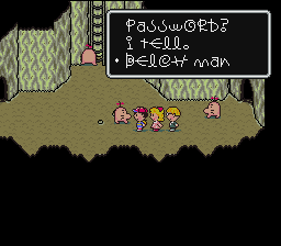 Came here to post that, or another Earthbound/Mother screenshot. The text in TWEWY comes to my mind - it's plain, but it's crisp and looks good with the style of the game. 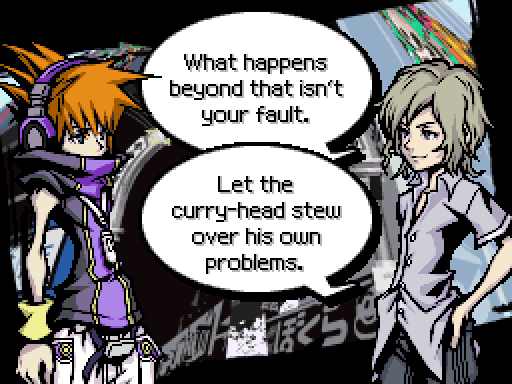 |
|
| | |
fronkhead
Disciple of Scullion
Posts : 1616
Points : 1694
Join date : 2013-01-18
| | Subject: Re: Fonts and the 'feel' of a game Wed 3 Jul 2013 - 0:31 | |
| - Balladeer wrote:
- I prefer the "Blech!" when you catch a giant isopod myself.
I praised the SM64 title font earlier, but now that I think of it, the game's font was pretty horrible. All tiny spidery white italics that did nothing to capture the majesty of the game. Pretty good for 1996, though. Its menu design has aged well, I think. A lot of games from that era have garish user interfaces. I love the font used in Ocarina of Time and Majora's Mask (and Ghost Trick and Fire Emblem Awakening). Was gutted they took it out of the 3DS remake, as the Japanese version used it again. |
|
| | |
beemoh
Koopaling
Posts : 2007
Points : 2050
Join date : 2013-01-15
Age : 39
Location : Writing and arithmetic
| | Subject: Re: Fonts and the 'feel' of a game Sun 10 Nov 2013 - 19:25 | |
| Came back in here as I'd noticed Pokémon Y's overuse of the system font and also I'm back on the Fire Emblem and was wondering if the font was the same one as Ocarina. Lo and behold: - fronkhead wrote:
- I love the font used in Ocarina of Time and Majora's Mask (and Ghost Trick and Fire Emblem Awakening). Was gutted they took it out of the 3DS remake, as the Japanese version used it again.
But! When did Ghost Trick use it? I've done a Google Image Search and it doesn't seem to use it at all. |
|
| | |
fronkhead
Disciple of Scullion
Posts : 1616
Points : 1694
Join date : 2013-01-18
| | Subject: Re: Fonts and the 'feel' of a game Mon 11 Nov 2013 - 9:41 | |
| - beemoh wrote:
- But! When did Ghost Trick use it? I've done a Google Image Search and it doesn't seem to use it at all.
It only really appears in some of the menus, from recollection the save menu and also the menu where you can look at an overview of the story, people etc. Here's how it looks on the iOS version (couldn't find the DS game but they both seem to use the same fonts from what I can see):  |
|
| | |
Balladeer
DIVINE LONELINESS
Posts : 26357
Points : 25192
Join date : 2013-01-16
Age : 34
Location : Admintown
| | Subject: Re: Fonts and the 'feel' of a game Fri 19 Sep 2014 - 11:57 | |
| Playing through the iOS version of Trials and Tribulations at the moment, and the font caught me eye. It's... remarkably sterile. Doesn't take anything away from the game, but it feels like they got it out of a "font collection" software package. 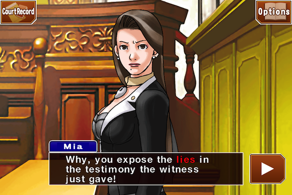 |
|
| | |
fronkhead
Disciple of Scullion
Posts : 1616
Points : 1694
Join date : 2013-01-18
| | Subject: Re: Fonts and the 'feel' of a game Fri 19 Sep 2014 - 19:15 | |
| THIS. Luckily AA5 uses the same font from the 3DS game, but I really don't know what they were thinking with 123 Trilogy. Square Enix used to be a big offender, using the OS's font as in-game text. Helvetica is a really nice font, but it does not fit Final Fantasy. Luckily they've stopped doing that, progress! |
|
| | |
Jimbob
Bargain Hunter
Posts : 4611
Points : 4637
Join date : 2013-01-15
Age : 41
Location : Milton Keynes
| | Subject: Re: Fonts and the 'feel' of a game Sat 20 Sep 2014 - 15:42 | |
| It's looks like Phishing PhotoShop Arial. Just though of another (non-Nintendo thing). One reason I might like Oblivion more than Skyrim, despite many technical updates: The interface in Oblivion was designed to feel like a part of the world; you're still sticking through menus, natch, but it really does make it feel like an epic adventure (see also the HeroQuest map books, nerds of a certain age):  Skyrim, however, has a sterile-looking HD-pleasing modern font: _Interface.png) |
|
| | |
fronkhead
Disciple of Scullion
Posts : 1616
Points : 1694
Join date : 2013-01-18
| | Subject: Re: Fonts and the 'feel' of a game Sun 5 Jul 2015 - 23:53 | |
| Splatoon! I love how bold and playful its text is, fits the theme of the game perfectly while still being easily readable. |
|
| | |
ZeroJones
I'M SO LONELY
Posts : 10465
Points : 9425
Join date : 2013-01-15
Age : 44
Location : North Midlands, England
| | Subject: Re: Fonts and the 'feel' of a game Mon 13 Jul 2015 - 11:36 | |
| Code Name S.T.E.A.M.'s, which is pure comic book.  |
|
| | |
Sponsored content
| | Subject: Re: Fonts and the 'feel' of a game | |
| |
|
| | |
| | Fonts and the 'feel' of a game | |
|
